NeoMusic 0.7.0: Onboarding, Visualizer Styles, and a New Theme
2026년 5월 2일
A more welcoming NeoMusic update with Vault search, Dystopian theme, new visualizer styles, and better localization.
NeoMusic started as a music player I wanted for myself. I wanted a player that actually looked like it was reacting to the music, not just showing a dead waveform and calling it a day. That idea got out of hand very quickly, and now the app has a Canvas-only UI, real-time spectrum rendering, lyrics, playlists, listening stats, premium customization, Android Auto, and a bunch of tiny visual details that took way longer than I want to admit.
With 0.7.0, I wanted to make the app feel less like something you had to decode and more like something you could just open, understand, and enjoy.
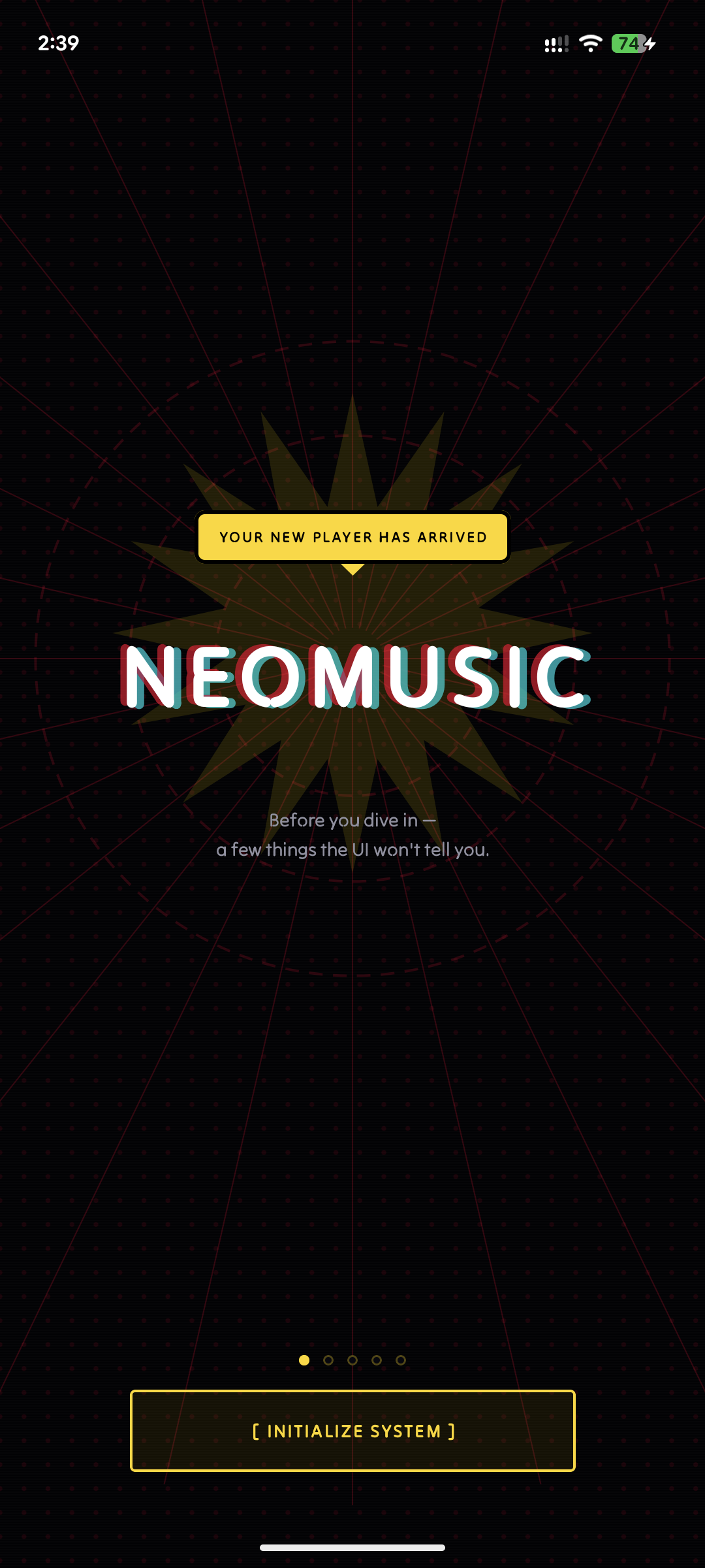
A Proper First Launch
NeoMusic is not a normal Android music player UI. There are no Material buttons sitting around doing standard Material button things. The player has an LCD, physical-style controls, animated spectrum views, a flip transition into other screens, a whole IDX section for Vault and Telemetry, and a bunch of settings that can completely change how the app looks.
That is cool if you already know what you are looking at. It is also a lot if you just installed the app.
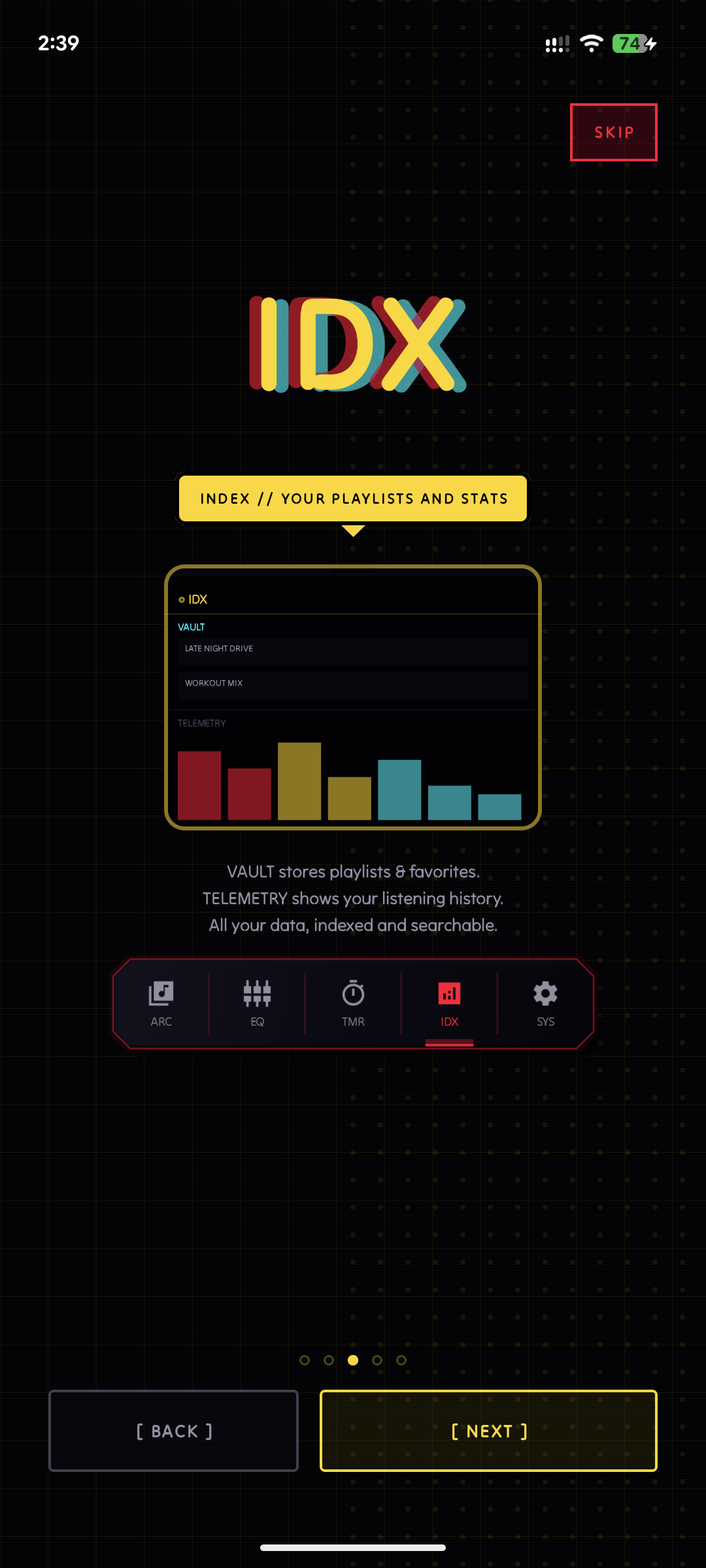
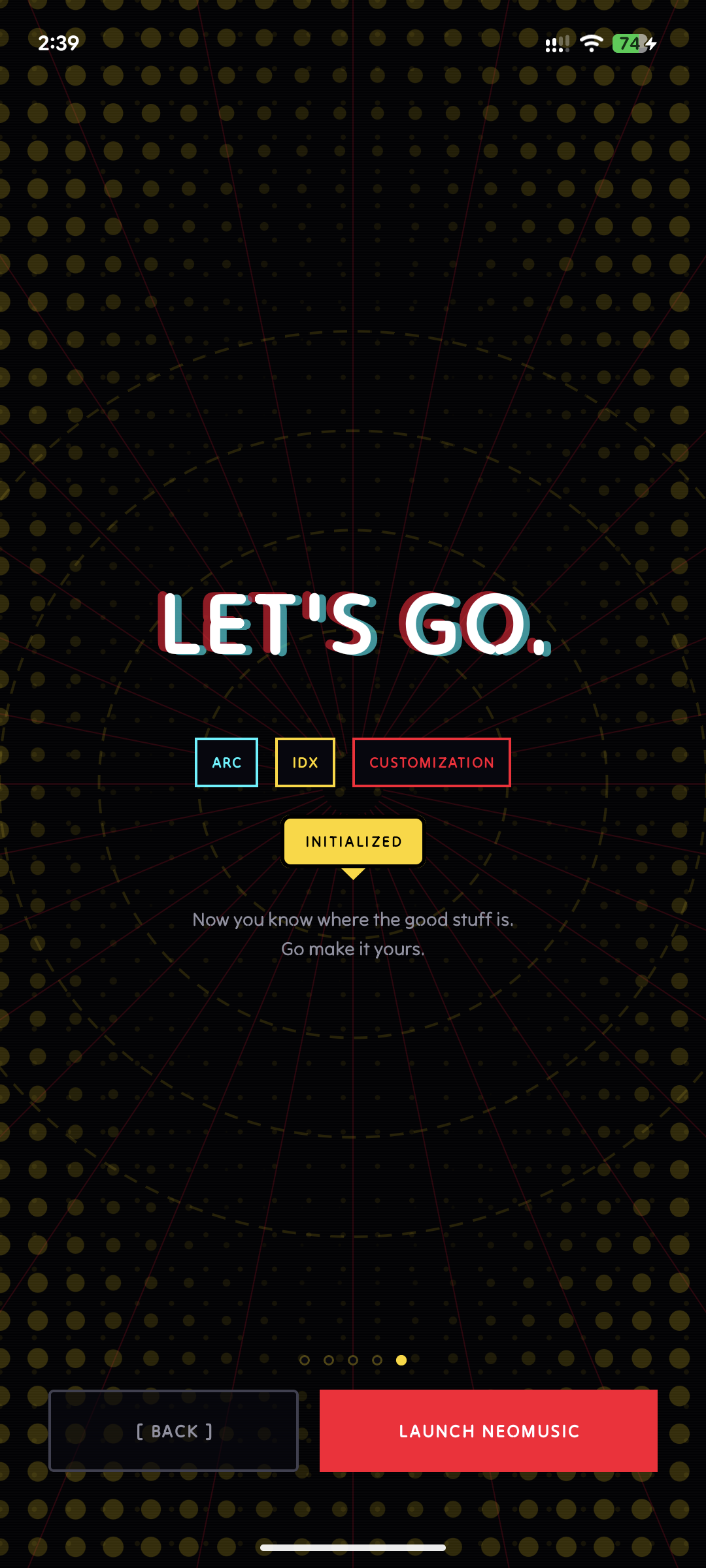
So I added a proper onboarding flow. I also added landscape support for it, because of course the one screen that teaches the app should not break when the phone rotates.
Then added replay support for the About screen, because hiding onboarding forever after the first launch felt wrong.
Vault Search
The last big update added the IDX screen. That screen has two sides:
- →VAULT, which holds playlists, favorites, recent hits, and old hits
- →TELEMETRY, which shows listening stats, uptime, weekday patterns, top tracks, and top artists
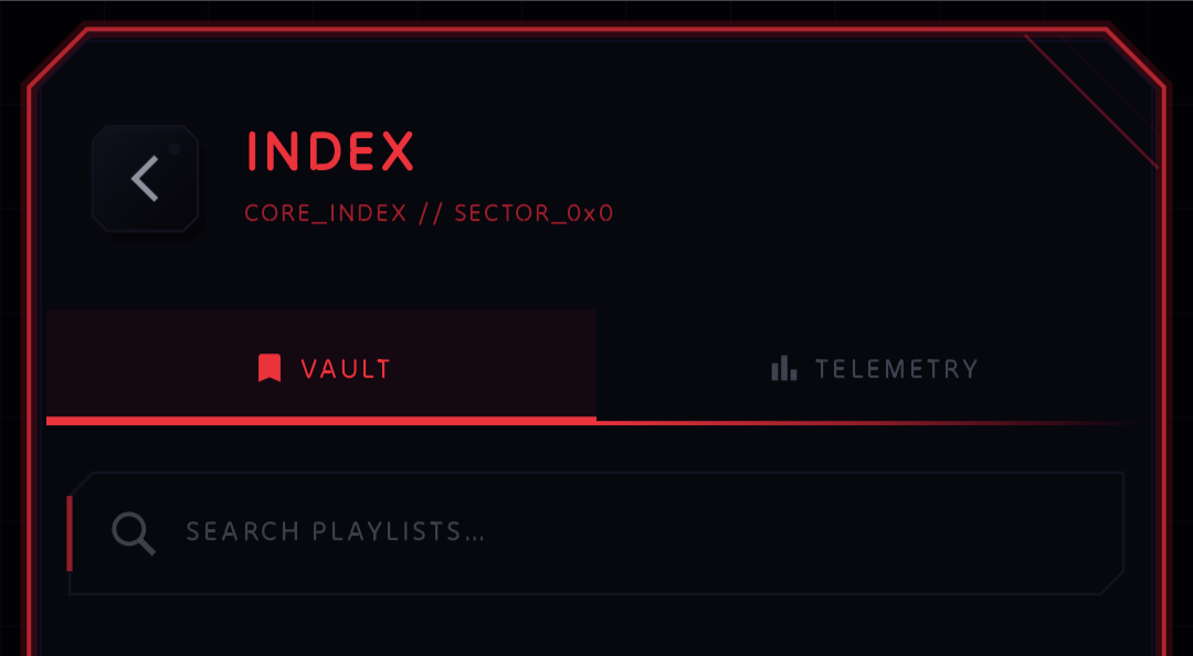
Once that landed, the obvious missing thing was search.
If you only have a few playlists, scrolling is fine. If you actually start using the app every day, it stops being fine pretty quickly. So 0.7.0 adds Vault search, which lets you get to playlists and collections faster without digging through the whole screen.
This is one of those features that does not sound loud in a changelog, but it makes the app feel much more practical. The Vault was already useful. Now it is easier to live in.
New Visualizer Styles
This was one of the features I had in mind for a long time.
NeoMusic already had the real-time spectrum analyzer, but I did not want the app to be locked into one visualization
forever. The audio data is already there through the custom SpectrumAudioProcessor, so the next step was making the
UI able to render that data in different ways.
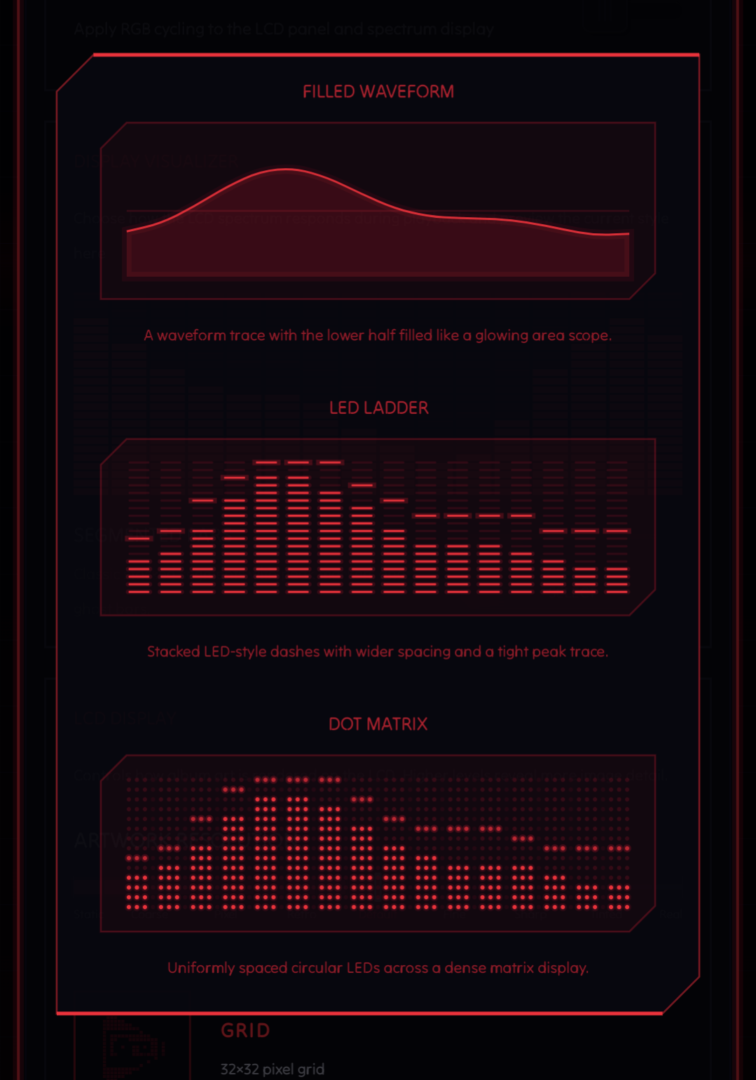
There are 5 new visualizer styles to choose from:
- →Bars
- →Waveform
- →Filled Waveform
- →LED Ladder
- →Dot Matrix
I had to refactor the visualizer rendering before this got too messy. It is very easy to take a working Canvas component, keep adding branches to it, and then end up with a giant drawing function that nobody wants to touch again. So the styles were split into a more modular setup before the feature got locked in.
These new styles are premium features. I think that line makes sense for NeoMusic. Core playback, lyrics, library, queue, Android Auto, and the main player should stay useful. Premium is where I put the heavier personalization features: custom accent colors, AMOLED mode, adaptive album-art colors, and now visualizer styles. Basically, if you want the app to feel more like your own console, that is the premium side.
Dystopian Light Theme
This one is funny because NeoMusic is very obviously a dark neon app.
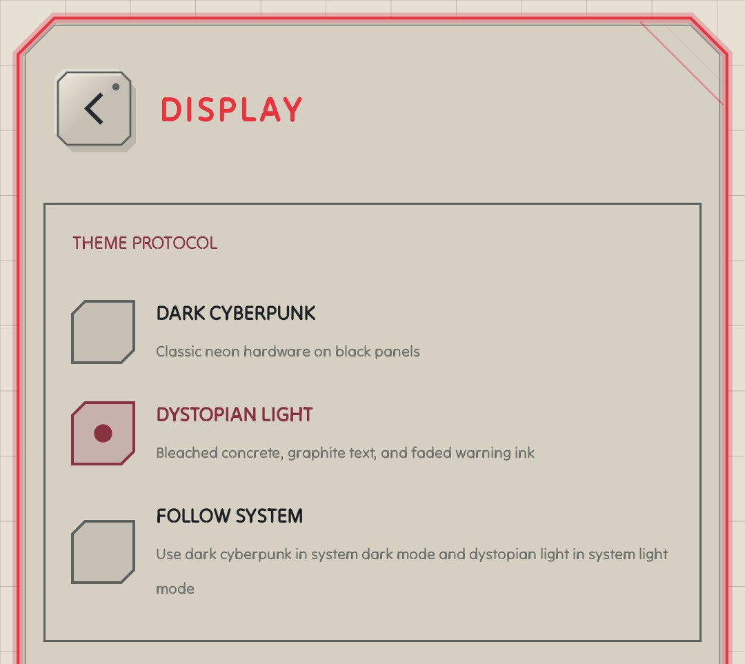
But I still wanted a light theme that did not look like someone just inverted the colors and called it a feature. So I added the Dystopian light theme. It keeps the app's sharp, high-contrast style, but gives people another mood to use when the full black-and-neon setup feels too heavy.
Doing this also forced me to clean up more theme color handling. NeoMusic has a lot of color-dependent UI: glows, panels, LCD text, spectrum bars, warning states, premium accents, adaptive album colors, and random tiny bits that only become obvious when the wrong color leaks into the wrong place. Since I am colorblind, this is exactly the kind of work that makes me stare at hex codes like they owe me money.
However, the light mode is still an eyesore for me. I don't do much testing with the light theme so please let me know if some of the dark side is bleeding into it.
More Languages
0.7.0 also adds Russian and Simplified Chinese translations.
Localization is one of those things that becomes painful if you do it late, so I am trying to keep it part of the normal release flow. NeoMusic already had the string resource structure and multiple language folders in place, so this update continues that work instead of treating translations as a side quest.
The changelog itself is translated too, because it would be weird to localize the app and then show patch notes only in English.
Small Fixes That Matter
I also moved the shuffle and repeat buttons closer together, fixed a glitch when switching shuffle, refined some player icons, adjusted theme colors, and added a warning around RGB spectrum mode.
These sound small, but with a fully custom UI, small things are never really small. There is no default Material layout quietly fixing spacing and states for me. If a button feels weird, that is on me. If the icon weight feels off, that is on me. If the spacing looks slightly cursed on one screen size, that is also on me.
So 0.7.0 has a decent amount of that cleanup work.